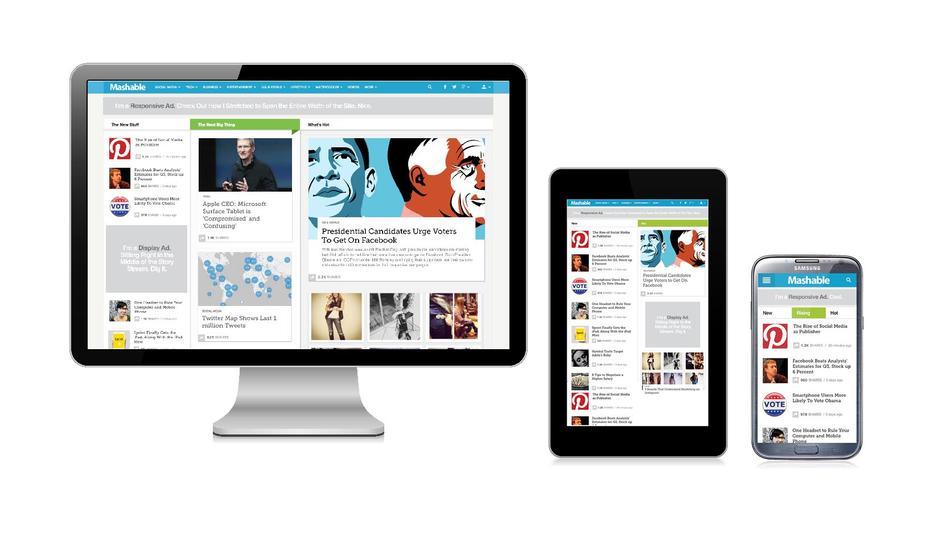
Why Do We Need Flexible Layout for Our Website?

It is important for us to make sure that our graphics could deliver the best impacts. Many of us tend to use hosting package and site builder to improve compatibility with users. As an example, latest versions of WordPress, Drupal and Joomla should work well on major web browsers on popular operating systems. There are also thousands of templates and themes that we can integrate with these website platforms. However, there are people who want to have full control of their graphics and designs. In this case, they will decide what images to choose and where they should be positioned.
We should be aware that the layout, design and theme could play a major part in our design. We should decide on how the quality of the graphic images should be processed. On many websites, JPG and GIF files are commonly used. Web designers are able to adjust their sizes and quality to strike a balance between quality and quick loading. This is essential for mobile users who can only access GPRS, EDGE or lower speed 3G connections in rural or less developed areas. The purpose of the website should be to attract the attention of visitors. In this case, we should make a positive decision on how the page should be viewed.
The header of the website should have logo and the name of the business prominently shown. The logo doesn’t have to be the largest image in the page, but it should be the most visible. In this case, it is important to choose logo design that can catch readers’ attention. It is no longer necessary to cut up images into multiple parts to make them faster to load; but we should still be sensible enough by balancing between size, quality and image dimension. Some web developers prefer the browser to preload images before other components in the website. In this case, they can be displayed when needed.
It should be noted that browsers could load webpages in different ways and orders. Although Chrome, Safari and Internet Explorer could work nearly the same; it is a good practice to check our website in all of them to make sure that they work identically. The layout of our website could differ slightly or significantly in each browser. There could be compensations that we should make, so websites could be pleasant to our eye and they are quicker to load. It could be a bad idea to use small images for background images, because they may not be pleasant to our eye. They could be multiplied across the screen, creating very distracting patterns on the screen.
It is important for us to create a good color scheme for the website and there are layouts that allow us to change the overall colors easily. This will allow us to changes specific colors due to seasonal changes to best match customers’ moods. Different layouts provide different results and we should be able to edit our results easily using proper tools in the market. The finished website should be appealing to everyone and our business must reflect the atmosphere of the industry. It is also essential to ensure the quick loading of the website.
