
 In 2010, on his first trip to Washington as British Prime Minister David Cameron gave Barack Obama a gift of a painting by Ben Eine. There’s nothing unusual in that as Presidents, Prime Ministers, Kings and Queens often give each other gifts. It was the choice of a work by Ben Eine which was the surprise as it consisted of nothing more than the words TWENTY FIRST CENTURY CITY in capital letters. Eine is well known for his “Graffiti art” using nothing but text and he is said to be one of Samantha Cameron’s favourite artists which is how it came to be chosen as a gift to the US President.
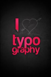
The reason I mention this is that it helps show how powerful Typography can be when used effectively.
There is much more to typography than just choosing the correct font and it is an art form in itself. Get it right and your design can have immediate eye appeal and great impact. Get it wrong and no matter what the message is it can be a complete distraction or could even stop people reading altogether. Your typography is the first noticeable thing about your work and is what gives the reader their first impression of your design. Even before a reader has read a single word they have probably made some sort of decision about what you have to say based on your choice or style of typography.
Back in the early days of printing fonts were limited in their complexity by the way they were made. In the very early days type was cut from wood and each letter had to be hand cut in the wood in all the different size. It was only later that type was cast in metal and fonts could be made much fancier due to the faster production method. The Victorian era in particular was a golden age in the use of Typography and lettering and it is a style very much in vogue at the present time. Think of the poster made famous by The Beatles which inspired the song “Being for the benefit of Mr Kite”. Although there are two illustrations at the top it is the typography that gives the poster its wonderful look and is very typical of its 1843 date. More recently, in 2011, the cover of the latest book by comedian Dave Gorman also featured a style reminiscent of the posters of the Victorian era.
In recent years there has also been a trend to make designs with a look of letterpress printing. This has become known as the “Lock Up” style and mimics the way type was locked up in the printers chase. Far simpler in style to the Victorian style it often uses fairly plain fonts with open spaces separated by lines. One of the secrets of its popularity is its simplicity.
It is simplicity which is perhaps the key to success with Typography. It is generally regarded that no more than three or four fonts should be used in any one design unless there is some important reason or other to do otherwise. Far better is to stick with one or two fonts and make use of things such as bold or italic lettering or different font sizes to emphasise headings or to emphasise important sections.
Choose fonts wisely as an unsuitable font can ruin what would be an otherwise acceptable design. Many modern fonts are fussy and have lots of embellishments and would be unsuitable for more formal situations but may be appropriate for things like birthday cards whereas a traditional font may be more suited for a business card where it is important to create an impression in a very small space.
There are no hard and fast rules regarding typography but ultimately you want your document or design to be attractive, attention grabbing and readable. Limiting the number of fonts keeps the readers attention on the subject and leads to more of the information being taken in. Less is often more and in the case of typography that is maybe the best way to start in order to achieve the best results.
We brought you this post courtesy of leaflet printing and design experts, Circle Services! For more information on what they have to offer, as well as their experience over the last 60 years, visit their website!