Some Design Rules Are Made To Be Broken
 by 74
by 74 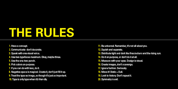

As with all matters of taste in life, web typography is subjected to all sorts of unwritten rules and guides that have been developed through years of trial-and-error and a gradual refinement of taste. The thing about rules, however, is that they are rarely arbitrary. In fact, the whole reason we arrive at certain patterns is because we see them working time and time again. The downside, however, is that relying solely on what has previously worked in the past tends to stifle creativity and innovation. Which is why an experienced designer knows when to bend the rules for a specific purpose and when to religiously adhere to them. In the following paragraphs we’ll explore four typical cases, two of which are great instances of “good” rule breaking, while the other two make for great examples of “if it ain’t broke, don’t fix it”:
Overrated Rule #1 – Always use a minimal number of fonts
As the defining aspect of your text, the fonts you employ should always be in harmony with your overall message. Having more than a few on the same webpage theoretically muddles the concept and makes it hard to follow. But it does work in cases when the website design is very text-oriented. In some situations, it can be used to convey a feeling of all-encompassing energy, while in others it can suggest a remarkable sense of creativity. Still, whichever fonts you use, remember to keep your text legible and allow each font enough space to shine on its own without cluttering up the whole page.
Overrated Rule #2 – Never stray from web-safe fonts
While the last thing you want is to use a font that isn’t widely accepted, recently there have been a number of font replacement programs that are making a big splash on the marketplace. For example, using something like sIFR or Typefasce.js allows your website to switch fonts at the ready. The technology is still in its infancy, however, so there are some likely issues if users disable Javascript or Flash, but rapid development is predicted in near future.
Sensible Rule #1 – Always avoid using display fonts for body copy
Being bold is one thing, being foolish quite another. Display fonts are usually flashy and in-your-face, a perfect strategy for titles and subheadings, but a poor substitute for cleaner fonts when it comes to bulky pieces of text. They tend to grow tiresome and are hard to read and follow, so make sure you keep them away from the actual info you’re trying to impart with your viewers.
Sensible Rule #2 – Never stretch your type
Another rookie mistake, if one that’s usually made with the best of intentions. Whenever you want to have slightly taller or wider letters, it can be tough to fight the impulse to just stretch the whole thing a little bit. But you have to take into account the fact that fonts are usually designed with precise attention to the shapes and proportions of each letterform, which means that even a slight modification can cause seriously noticeable distortion. A better alternative is to simply opt for a font that’s naturally tall or wide enough to suit your needs. In today’s busy market, you’ll definitely have plenty of good ones to choose from.
In conclusion, when it comes to designing a webpage, one doesn’t really have to follow the rules as much as simply respect the visual cues that any given piece sends out to its viewer. It’s the quickest and easiest path towards making something truly beautiful.