Mistakes Made by Mobile Sites
 by 18
by 18 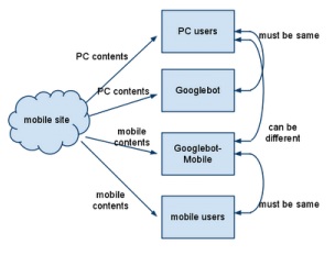

Mobile optimisation is an essential consideration for any modern website. In fact, coming updates to Google’s search algorithms will see well-optimised sites getting a ranking boost, which means many webmasters are currently battling to bring their sites up to scratch.
But merely adapting the interface to operate with a touchscreen display is not enough to keep visitors happy or appease Google’s automated assessment process. Thankfully, there are ways to avoid mistakes and prepare for a mobile-oriented future.
If a page features multimedia content, such as embedded videos, then you need to ensure that these can be accessed from mobile devices or else Google’s algorithm will detect that it is unplayable. This means it is important to move away from using Flash-based content and instead harness HTML5, which is far more compatible with modern mobile browsers.
When a site has opted to create separate mobile URLs rather than choosing responsive design, each desktop page will need to automatically redirect mobile users to the correct optimised page. But broken redirect links, or those which point mobile browsers back to the home page rather than to the correct mobile page, are all too common and must be addressed.
The best solution is to harness Somerset web design offered by somersetwebservices.co.uk to get a responsive site, with pages that adapt based on the device which is being used to view them. Rather than having separate URLs for desktop and mobile pages, this approach will keep a site unified and avoid redirect conundrums.
When it comes to putting off visitors and falling foul of search algorithms, page-load speed is critically important. And this is doubly true when it comes to sites that are being accessed from mobile devices.
Google offers webmaster tools that allow you to work out why sluggish page-loading may be occurring. Although ultimately the answer may lie in optimising the design, reducing the amount of embedded content and keeping things simple yet effective to ensure speed.
A mobile site which does not allow Google to access things such as JavaScript, CSS and image file elements will most certainly encounter SEO problems, which is why it is important to ensure that crawling is allowed to ensure that indexing can occur without hindrance.
The ability to check the mobile-friendliness of a site using Google’s dedicated testing tool will ensure that there is no ambiguity in this area.
Common mistakes made with mobile sites can lead to better-prepared competitors getting the edge. And once the mobile optimisation algorithm goes into effect from the 21st of April, Google will be much quicker to penalise any sites that have not prepared themselves to operate in this new era.
SEO need not be a taxing process if you arm yourself with the right information and are willing to keep pace with the evolving marketplace to ensure that a site meets the expectations of visitors and also does the things that Google expects.

