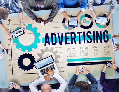
How to Properly Manage Ads in Our Website?

Many website owners want to place ads on their website and it should be noted that poor integration will cause people to quickly click away. It should be highly profitable to ensure successful ads integration into our website. However, there are things that we need to consider if we want to position ads in the website. As an example, we should make sure that we have proper ads-to-content ratio. The traffic and user experience in the website will suffer if there’s a high proportion of ads compared to content. Instead of making money, we will actually lose money. If we want to make money from advertising, we actually need to be sensible when adding ads in our content.
One big concern is the optimum ratio of advertising to content. It should be less than 25 percent compared to content. Go above this ratio, and our revenue will eventually go down. The only way to exceed the ratio is by making the content advertising messages, without users realizing it. In this case, users will read the content without knowing that they are reading advertising messages. This can be achieved if we don’t obviously advertise the products and services. We could provide supporting information that will encourage users to know more about our products and services.
Many websites use the exact types of banner on all pages. We should be aware that if people don’t respond to the banner on the first page, we shouldn’t expect them to become responsive on the tenth time they see it. People will find it rather annoying to see the same kind of advertising for dozens of times. This will cause us to lose money. It is important to keep our advertising messages fresh. Even without repeating the text and images, ads are already boring enough. In order to make our job easier, it is a good idea to use the banner rotator feature, so advertising can change regularly.
Text advertising should receive the biggest response. In this case, advertising should be related to graphics or text. They must be placed in the areas where people will likely to notice. All things being equal, we should find that graphic-based ads are more appealing than text-based ads. Higher responses will ensure improved conversions. Animation is essential, but we shouldn’t take it to an extreme. Animations could actually annoy people and they will cause lower responses. In this case, visitors shouldn’t click away from the website. In this case, visitors shouldn’t click away when they want to know more about the product.
In this case, we should know where to appropriately position ads on our webpage. In general, the layout can be separated into multiple components, such as header, footer, right margin, left margin and center column. Pop-up windows are also often considered as a webpage area and it is actually more polite to use the self-closing type. Intrusive pop-ups could actually cause more people to refuse returning to our website.
