5 Essential Tools For Responsive WordPress Design
 by 33
by 33 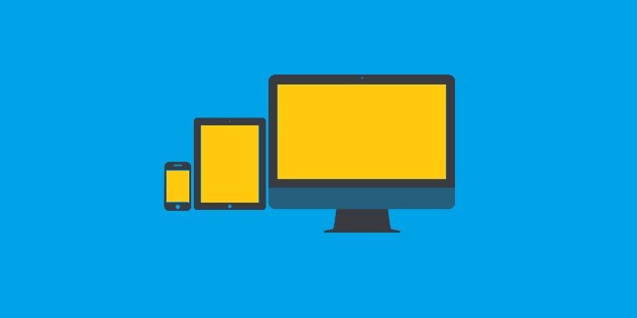
As mobile-users continue to overtake the world (so it seems), web design has effectually become synonymous with responsive design. To the lucky few for whom the term means nothing, responsive design is the practice of creating websites that can fit comfortably on all devices, from the tiniest smartphone to the most ostentatiously large laptops and desktops.
WordPress design has kept pace admirably, thanks largely due to WordPress’ own rapid paced core development as well as the huge marketplace that keeps designers and front end developers consistently on their toes. But if you are to handle the massive demand of responsive WordPress designs and themes, you are going to need a few aces up your sleeves.
In this post, I have listed 5 quintessential tools for responsive WordPress design, all aimed to make your work easier, faster, and more fluid.
Take a look at:
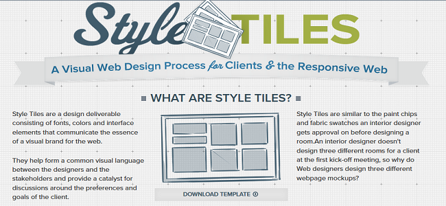
This simple mockup/ Wireframing tool is one of the simplest out there. And it’s not happenstance. This little beauty was meant to be so elegantly simple so as to leave developers wondering “Why did we not think of it ourselves?”
Style Tiles isn’t an advanced, feature packed UI prototyping tool. It’s more of a “way to start discussions around a design idea.” Basically, the tool gives you a mockup drawing (literally) which would server to be used as a visual aid that can be used during client briefings/ meetings for better communication. The templates are easy to create and can be repurposed to depict anything from starting points to project development/ state to finished product. It’s more like a pen-and-paper style template that someone brought to the digital realm and gave a name to.
But for idea generation and brainstorming sessions, it’s really quite helpful. You will have to try it yourself to see. Also: It’s better than wasting your time in Photoshop.

ZURB’s responsive web design framework Foundation is by far the best in class (and on the web) responsive framework available. That holds true even in 2016.
The framework comes complete with fluid grids, brilliant user interface modules and tools, SASS compatibility and LibSASS prepackaging, added actions and features for better customization of multi level drop down menus, jQuery support, and near universal compatibility with latest versions of all major browsers and operating systems.
While WordPress designers prefer Twitter Bootstrap, I personally love Framework. There’s more to do and the framework gets it done 5 times faster and better.
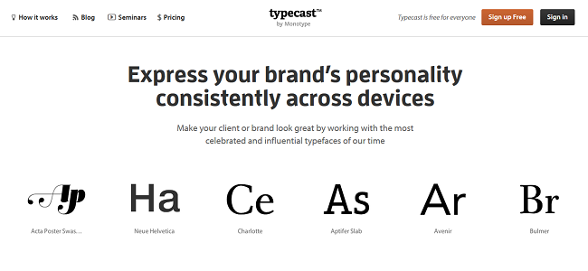
TypeCast, a monotype creation, is a lovely thing, and works as a perfect substitute (especially for a beginner or someone with tight and/or holey pockets) to Adobe’s super comprehensive TypeKit.
Typecast is simple. The tool is completely available online and lets you design typefaces and see them in action with live previews (with real time edits!). It also gives you some frankly amazing to look at pre-built style templates (which can cut your time input by half or more) and a whole wide variety of some of the best collection of fonts you see on the net.
It needs registration. Free sign ups get over 3.5k fonts to work and play with, while premium subscribers (3 subscriptions for $10 a month) can access the entire library which includes about 25 thousand fonts, along with HTML/ CSS code to put your designed typeface to use in your own WordPress frontend design.
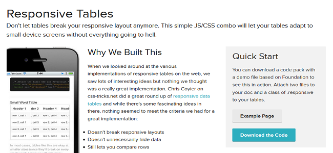
TablePress is great for your end clients, but you, as a designer, need to rely on ZURB responsive tables; which is a brilliant power packed tool.
As suggested in the name, this tool lets you easily create responsive tables for your front end site designs. All you get are two files, responsivetables.js and a stylesheet responsive-tables.css, both of which will transform the way you have been creating tables as a web designer. Attach these files with your markup, and you are done. The scripts are written smart, and they won’t ‘hide’ rows or columns out of sight unless it’s the last available option based on the users’ device’ viewport.
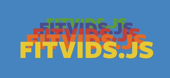
I had to include a jQuery masterpiece.
Since today’s the age of rich media content, there are little chances of you not embedding some instructional or simply entertaining videos on your website. Fitvids.js will take care of making them all fit on your users’ devices, this way or that.
The script (for there’s just one JavaScript file) will turn your padding units to percentage values in order to maintain site design integrity and still show the video comfortably to visitor’s with smaller viewports. It’s lightweight, and it works with video embeds like a charm.
Wrapping up
There you are – 5 of the best, but still underrated tools for responsive WordPress design. Make sure to check them out and share your experience with us in the comments section below.