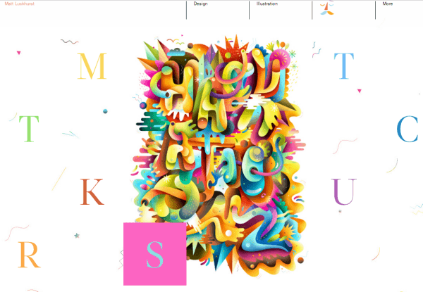
<p style="text-align: justify;">One of the more important elements of web design is typography. When implementing effective typography, we should make sure that text has proper style, color and size. Fonts must be webs safe, with the proper alignment and the right amount of leading, kerning and spacing. One thing that we need to consider is that the same font could work and look differently in websites and print media. We should be aware that not all Internet-capable platforms are compatible with the font we use. CSS allows us to declare specific fonts with @font-face, so we can choose from any True-type or Open-type font available.</p>
<p style="text-align: justify;">Font stack is another way to make sure that our fonts are completely web safe. With this feature, we will be able to create a list of fonts we should use based on an order of precedence. It means that if our primary font isn’t working on a user’s computer, there’s an additional option to fall back on. Spacing is another factor that can improve the readability of our website. White space is essential when we want to improve professionalism to our website. It means that it should be easier to comprehend specific text on our website. When dealing with typography, we need to consider things like word spacing and letter spacing.</p>
<p style="text-align: justify;">White space around letters plays a significant role in helping users to discern each of them. Letters can also be made more legible. In essence, we should use white space to improve comprehensibility. This also applies for word width and spacing. Line height deals with the empty space between text lines. Again, web designers should fine tune this to increase the overall legibility. The entire text will be easier to read and become more interesting. Alignment check is an important factor when dealing with typography. It helps us to present text in a neater way. This factor can be tweaked to provide useful fine effects to our website.</p>
<p style="text-align: justify;">We may also want to mix fonts and without proper balance, this could prove to be quite disastrous. Mixing multiple drinks that taste good doesn’t always result in a good-tasting beverage. We should make sure all elements can be mixed properly. We need to strike the proper balance between various elements. It’s best to stick to two or three fonts, instead of using too many fonts that can confuse users. Typography for in-content links is also an important factor. We should make sure links stand out elegantly, not too intrusive, but also not buried within regular chunks of text. A good idea is to alter the color and use proper style of fonts.</p>
<p style="text-align: justify;">The navigation area is among the most interactive parts of the website and it needs to get the right attention. For the navigation area, we should use the proper font type and some of the areas may need to be highlighted properly with the right kind of text. We should use the right contrast to make text more legible.</p>

How To Use Typography When Designing A WebSite?
