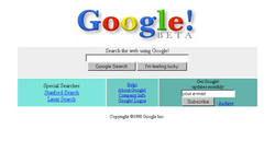
<p style="text-align: justify">If you are old enough to remember having to wait for your parents to finish their phone call before you could get online, generally waiting a good couple of minutes to download the latest round of humorous pictures that your friends emailed to you, then it is a good chance that you will remember some of the earliest designs of some of the world&#8217;s most famous websites. Of course 20 years ago, the lack of processing power in home PCs coupled with the previously mentioned glacial pace of most people&#8217;s connections meant that these sites offered a far less rich environment than they do now.</p>
<h3 style="text-align: justify"><strong>Google &#8211; Established 1996</strong></h3>
<p style="text-align: justify">Google&#8217;s first design contained the swathes of white space that we have become accustomed to over the years, but had far fewer options than we now have to choose from. Instead of being able to navigate to Gmail, Maps, YouTube and a whole host of other services from Google&#8217;s homepage, this was back in the day that the search engine giant was a mere upstart. The home page also boasted an index of 25 million web pages, but promised that this would become much larger.</p>
<h3 style="text-align: justify"><strong>The Facebook &#8211; Established 2004</strong></h3>
<p style="text-align: justify">Whilst films such as The Social Network showed how Mark Zuckerberg&#8217;s website was founded, the site that so many of us know and love today bears no resemblance to the original site launched to allow university students in the USA to communicate with each other. Featuring almost no images and a soon to be discarded &#8220;the&#8221; in favour of streamlining the name and an inability to sign up unless you were a student at one of a few schools, the site was far less visually appealing than the Facebook of today.</p>
<h3 style="text-align: justify"><strong>BBC News &#8211; Established 1997</strong></h3>
<p style="text-align: justify">One of the most common issues with any popular site comes when the redesigns take place. Whilst the BBC&#8217;s first news website was built to be viewed on connections that are far less fast than those we enjoy today, the ever changing landscape of technology ensures that sites undergo regular facelifts. The most recent upgrade of the BBC website saw it become responsive to a wide amount of devices, from desktop PCs to mobile phones and tablets.</p>
<p style="text-align: justify">When looking to move your website to a more modern or responsive design, whether based in Manchester, Newcastle, London or Cheltenham Web Design agencies such as ma-design.biz can help you to implement any changes needed.</p>
<h3 style="text-align: justify"><strong>MySpace &#8211; Established 2003</strong></h3>
<p style="text-align: justify">The star of MySpace burned bright, but also did not burn for very long. At one stage, MySpace&#8217;s users outstripped those of Facebook considerably, but Zuckerberg&#8217;s social media giant was soon to eclipse its predecessor. MySpace&#8217;s original home page again featured very little in the way of images, instead using rather stylised avatars to show the message of the site. The options to sign up to the site in fact took up almost half of the splash page.</p>

Back To Their Roots – How The World’s Most Famous Websites Looked When They Launched
